Loading…
Data Analytics
A collection of real-world Data Analytics experience - turning raw data into actionable insights that drive business decisions.
Diagrams on this page are illustrative recreations of systems I built — production dashboards and client data are omitted for confidentiality (NDA).
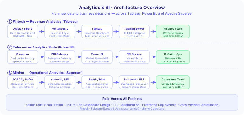
Architecture overview across all three analytics use cases — Fintech, Telecom, and Mining
Use Cases
Revenue Analytics Dashboard — Payment Switching
FintechDesigned a centralized Tableau-based revenue dashboard for a payment switching company, covering multi-channel revenue logic (HIMBARA & non-HIMBARA), rigorous business validation, and enterprise deployment on a RedHat Tableau Server.
Telco Analytics Dashboard Suite
TelcoBuilt an end-to-end analytics dashboard suite in Power BI for an Indonesian telecommunications company - covering Market Share, NPS, LTV, and Tower Effectiveness - connected to on-premise Cloudera via Enterprise Gateway, with Python custom visuals, and cross-vendor collaboration from Europe & Asia.
Mining Operations Analytics with Apache Superset
MiningBuilt an end-to-end operational analytics dashboard suite using Apache Superset for the mining industry - from Hadoop ecosystem to real-time visualization - covering conveyor monitoring, overspeed analysis, fuel consumption, and driver fatigue, with RLS implementation and self-service analytics training.
Revenue Analytics Dashboard — Payment Switching
As Senior Data Visualization (semi Project Lead), I led the end-to-end development of a centralized revenue analytics dashboard for a payment switching company in the financial services industry. The dashboard integrates multi-channel data from core systems (Oracle → Tibero) through a Pentaho pipeline, visualized in Tableau, and deployed to an enterprise Tableau Server on a RedHat environment.
📊 Impact
- Centralized revenue dashboard, easy to use by business stakeholders
- Revenue accuracy maintained through robust data modeling and business validation
- Optimal dashboard performance - heavy logic at the data layer (Pentaho), not the presentation layer
- Successful integration with enterprise environment (Tableau Server, RedHat)
- On-time delivery aligned with business monitoring needs
🧩 Tech Stack
Tableau, Tableau Server, Pentaho (ETL & Data Modeling), Oracle → Tibero (Database Migration), RedHat (Server Environment)
📌 Background
- Revenue comes from multiple transaction channels: general channels (non-HIMBARA) and dedicated HIMBARA channels (state-owned bank consortium)
- Revenue calculation is complex: multi-channel, multi-rule logic
- Data sourced from core systems undergoing Oracle → Tibero migration
- No centralized dashboard existed for real-time or near-real-time revenue monitoring
⚡ Problem Statement
- Present an accurate and business-friendly revenue dashboard for stakeholders
- Ensure revenue calculation validation aligns with applicable business logic
- Maintain on-time delivery for monitoring needs
- Integrate the dashboard with the enterprise environment (internal Tableau Server)
- Risk of data mismatch due to Oracle → Tibero migration
🧠 Solution Overview
- Acted as Senior Data Visualization (semi Project Lead): designed the dashboard, ensured alignment between business logic and visualization
- Collaborated with Data Engineering team for the Pentaho pipeline: ETL, data modeling (Fact & Dimension tables), and business rules
- Calculation strategy: heavy computation (complex revenue logic, large aggregations) in Pentaho; lightweight logic (ratios, filtering, calculated fields) in Tableau
- Collaborated with Infra team for Tableau Server setup and customization on RedHat
- Managed the full lifecycle: development → validation → deployment
🏗️ Architecture
- Source Layer: Oracle (legacy system) - core transaction data source
- ETL Layer: Pentaho - data transformation, revenue calculation logic, aggregations, and business rules
- Target Layer: Tibero (new database) - result of Oracle → Tibero migration
- Data Modeling: Fact Table (revenue, transaction count) + Dimension Table (Channel HIMBARA/non-HIMBARA, Time, Transaction Category, Business Attributes)
- Visualization Layer: Tableau - revenue per channel, revenue trends, transaction category breakdown, business performance monitoring
- Deployment Layer: Tableau Server on enterprise RedHat server, with custom login page and component adjustments per client requirements
🔥 Key Challenges & Solutions
- Revenue Validation: revenue calculation had to be 100% accurate - solution: cross-checked fact table against source data, validated with business stakeholders
- Oracle → Tibero Migration: risk of data mismatch - solution: validated data at the Pentaho layer before visualization, synchronized logic across systems
- Performance Optimization: dashboard slow if all calculations in Tableau - solution: pushed heavy computation to Pentaho, Tableau handles lightweight logic only
- Tight Delivery Timeline: dashboard needed quickly - solution: focused on core metrics first, iterative delivery approach
- Enterprise Customization: custom Tableau Server configuration required - solution: collaborated with infra team, modified login page and server settings
Telco Analytics Dashboard Suite
The Story
A major Indonesian telco needed one analytics suite covering four business domains: Market Share, NPS, Customer LTV, and Tower Effectiveness. The challenge wasn't just building dashboards — it was the data. Three completely different ingestion paths needed to converge: real-time SDR events through Kafka and Spark Streaming, scheduled BSS/OSS batch exports via SCP and Python ETL, and competitor data harvested through Selenium crawling. All of it landing on Cloudera on-premise, organised into a Medallion Architecture (Raw → Silver → Gold). From there, Impala served as the query layer, bridging on-premise Cloudera to Power BI Service via Enterprise Gateway — with Master Mapping Excel feeding dimension reference data directly to Power BI Desktop. The result: four production dashboards giving leadership real-time competitive visibility, NPS trends, retention intelligence, and network infrastructure prioritisation — all in one suite.
As a Senior Data Visualization Specialist on the vendor side, I contributed to building an end-to-end analytics dashboard suite for an Indonesian telecommunications company — from 3 ingestion paths (SDR streaming, CSV batch, web crawling) into a Cloudera Medallion Architecture (Raw → Silver → Gold), through to Impala + Enterprise Gateway consumption in Power BI Desktop and Power BI Service. Dashboards cover Market Share, NPS, Customer LTV, and Tower Effectiveness.
📊 Impact
- Market Share dashboard delivered real-time competitive visibility to leadership
- NPS Dashboard supported continuous customer experience evaluation and improvement
- Customer LTV Dashboard enabled marketing to allocate retention budget to the right segments
- Tower Effectiveness Dashboard supported network infrastructure maintenance prioritisation
- Medallion Architecture ensured optimal dashboard performance — Gold Layer pre-aggregated, Impala queries fast
🧩 Tech Stack
Power BI Desktop, Power BI Service, Apache Impala (Cloudera ODBC), Power BI Enterprise Gateway, Apache Kafka, Spark Streaming, Python ETL, Selenium WebDriver, Cloudera CDH (HDFS + Hive), Medallion Architecture (Raw / Silver / Gold), Python Custom Visuals, Master Mapping Excel
📌 Background
- Telco required end-to-end analytics from diverse data sources: SDR real-time events, BSS/OSS batch exports, competitor data, and reference data
- On-premise Cloudera data platform with Medallion Architecture (Raw, Silver, Gold) built by the Data Engineering team using Spark
- Power BI as the company's standard visualization tool — needed to be connected to Cloudera via Impala and Enterprise Gateway
- Involved as Senior Data Visualization Specialist on the vendor side, collaborating with vendors and principals from Europe and Asia
⚡ Problem Statement
- Integrate 3 different ingestion paths (SDR streaming via Kafka/Spark, CSV batch via SCP/Python, web crawling via Selenium) into one platform
- Connect Power BI to on-premise Cloudera through Impala connector and Enterprise Gateway
- Maintain optimal dashboard performance with large telco data volumes
- Deliver 4 critical analytics domains (Market Share, NPS, LTV, Tower Effectiveness) accurately and in real-time/near real-time
- Coordinate with vendors and principals from Europe and Asia for requirement standardization
🧠 Solution Overview
- Path 1 — SDR Streaming: SDR Data → Kafka → Spark Streaming → Cloudera Raw Layer (near real-time)
- Path 2 — CSV Batch: CSV Export (BSS/OSS) → SCP Server → Python ETL → Cloudera Raw Layer (scheduled batch)
- Path 3 — Web Crawling: Selenium Crawler → Cloudera Raw Layer (competitor data)
- Medallion Architecture: Raw → Silver (cleaned & normalised) → Gold (pre-aggregated, BI-ready)
- Consumption: Impala as query engine → Enterprise Gateway → Power BI Desktop (dev, Impala connector) → Power BI Service (prod)
- Master Mapping Excel connected directly to Power BI Desktop as dimension reference data (bypasses Impala)
- Python custom visuals for complex visualization needs not available in default Power BI
🏗️ Architecture
- Ingestion Path 1 (Streaming): SDR Data → Apache Kafka → Spark Streaming → Cloudera Raw Layer
- Ingestion Path 2 (Batch): CSV Files (BSS/OSS export) → SCP Server → Python ETL → Cloudera Raw Layer
- Ingestion Path 3 (Crawling): Selenium WebDriver → Cloudera Raw Layer (competitor data)
- Medallion — Raw Layer: all data lands here, immutable, append-only, no business transformation
- Medallion — Silver Layer: cleaned & normalised data, cross-source joins, sometimes consumed directly by Power BI Desktop
- Medallion — Gold Layer: pre-aggregated, domain-specific, BI-ready — primary source for all 4 dashboards
- Query Engine: Apache Impala — exposes Silver & Gold as JDBC/ODBC endpoints to Power BI Desktop
- Enterprise Gateway: on-premise Cloudera ↔ Power BI Service bridge for scheduled refresh
- Power BI Desktop: development environment, direct connection to Impala via Cloudera ODBC connector
- Master Mapping Excel: dimension reference data (code → name mappings, region hierarchy, KPI thresholds) connected directly to Power BI Desktop — used sometimes
- Power BI Service: dashboard distribution platform to all stakeholders
🔥 Key Challenges & Solutions
- Hadoop Connectivity: configuring Impala connector + Enterprise Gateway to on-premise Cloudera — multiple iterations with infra team to stabilise
- Multi-Source Integration: 3 different ingestion paths with different formats and latency — standardised at the Medallion layer
- Performance on Gold Layer: large telco data volumes — heavy aggregation pushed to Spark (Gold layer), Impala & Power BI only query aggregated results
- Master Mapping Excel: business-owned reference data — connected directly to PBI Desktop, bypasses pipeline to avoid unnecessary overhead
- Cross-Vendor Collaboration: coordination with vendors and principals from Europe & Asia — standardised requirements and aligned cross-vendor communication
Mining Operations Analytics with Apache Superset
After the data platform and analytical cube were built, I served as both Data Engineer and Data Analyst to deliver operational dashboards using Apache Superset in the mining industry. This covered end-to-end work: Hadoop connectivity, Row-Level Security (RLS) implementation, and structured end-user training for self-service analytics.
📊 Impact
- Operational dashboards available for real-time monitoring of conveyors, overspeed, fuel consumption, and driver fatigue
- Optimal performance through cube (heavy) + Superset (light) combination strategy
- Data secured through cross-division Row-Level Security implementation
- Improved user capability through structured training
- Drove self-service analytics adoption by the business team
🧩 Tech Stack
Hadoop (HDFS), Analytical Cube, Apache Superset, Row-Level Security (RLS), Data Modeling & Aggregation
📌 Background
- Data platform and analytical cube had been built on the Hadoop ecosystem
- Operational dashboards needed for real-time and near real-time field monitoring
- Data access control required between divisions (data governance)
- Goal to drive business team self-service analytics adoption
⚡ Problem Statement
- Present data from the Hadoop ecosystem to the visualization layer efficiently
- Maintain dashboard performance with a heavy vs light calculation strategy
- Work around visualization limitations in Apache Superset
- Implement Row-Level Security (RLS) for cross-division data access control
- Drive user adoption through structured training
🧠 Solution Overview
- Heavy calculation in the cube (data layer): aggregations and core business logic stored in the analytical cube
- Light calculation in Apache Superset (presentation layer): queries against pre-aggregated data
- Configured Superset connectivity to the Hadoop ecosystem through iterative adjustments with the infra team
- Implemented Row-Level Security (RLS) to restrict data access per division
- Delivered end-user self-service analytics training: 2 batches, 3 days each, outside Java island, using pre-test & post-test methodology
🏗️ Architecture
- Data Layer: Hadoop ecosystem (HDFS + processed layer) - stores mining operational data
- Cube Layer: Analytical cube - stores aggregations and heavy business logic for query efficiency
- Visualization Layer: Apache Superset - queries cube, applies light calculations, renders operational dashboards
- Security Layer: Row-Level Security (RLS) - restricts data access by division
- Key dashboards: Conveyor Real-Time Speed Monitoring, Overspeed Analysis, Fuel Consumption Analysis (Mining Trucks), Driver Fatigue Analysis
🔥 Key Challenges & Solutions
- Limited Visualization Capability: Superset lacks many visual options compared to enterprise tools - solution: creative chart combinations and workarounds for complex visual needs
- Hadoop Connectivity Issue: initial difficulty setting up the Hadoop connector - solution: iterative configuration adjustments and infra team coordination until stable
- Performance Optimization: dashboards slow when all calculations at the visual layer - solution: pushed heavy logic to the cube, Superset handles light computation only
- Data Access Control: cross-division data must remain restricted - solution: implemented Row-Level Security (RLS)
- User Adoption: users unfamiliar with tools and data - solution: structured training, 2 batches × 3 days, with pre-test & post-test methodology
Explore other domains
To go back to profile, click here.